The Challenge
The designers must make an outfit for a spring cover of Marie Claire to be worn by Heidi. The winner will actually have the cover shot. The actual editor of MC is the guest judge and points out some things they're looking for: no busy or pale fabrics because they won't work well with the backdrop or the coverlines, spring colours, stuff that's interesting from the waist up because of where the shoots tend to cut off the model. Many of the designers seemed to have listened to none of these points.
Dresses by Designer
Amy
Did not listen to the idea that busy fabrics should be avoided. The base is a medium grey but I see orange, pink, red, and gold. I can't tell what the actual pattern is because of the way it's draped, with a cascade of ruffles. The dress is short in the front and calf-length in the back. From the side it makes her model look pregnant, which, um, I'm pretty sure they're waiting til Heidi drops the next kid before shooting, so, no good. There's a sorta ruffle-cum-flower at the top right. I don't like it. Everything appears to be edged in black, and there's a black waistband. I'd probably like the fabric if it were on a less busy dress, but the combination of the two does not work and the fabric is probably too varied to work well as a cover shoot anyhow.
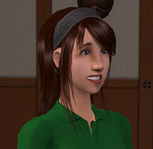
Anna
Anna's outfit would be fine if Heidi were 15. She's not. Also, when I say "fine", I mean "not really standout". I give her credit for the pretty pale azure she chose for the top and the slightly darker detailing coming down from the neckline. The fabric appears to be sheer and placed over white, actually, because the neckline and straps are sheer. The top is also basically a loose tank. A vest in light bronze paired with a desaturated brown is not really all that interesting, either. There's a pair of short-shorts in dark grey pinstripe to finish the outfit. If this were a teen going to the beach she'd be reasonably well-dressed. For an adult fashion magazine with an older model, it is wrong, wrong, wrong.
Anthony
First off, I love the azure fabric he used, and think it helped this look be very cover- and spring-appropriate. The dress itself is a sorta cocktail mini with this cascade of flowy ruffles forming the front part of a strap and extending down in a diagonal. The bottom third of the dress is asymetrically ruffled as well. From the front the dress is amazing. In back it's a little off; the single, wide strap isn't as appealing and the ruffles don't meet up right at the center. But for a cover look no one's going to see that, so who cares?
Ben
Ben said his inspiration was Madame Butterfly, and I can see that in the way the center of the front has a sort of kimono-style wrap look. The dress is sleeveless and mid-thigh length, and the base colour is a very deep, saturated blue. Along the closure in the front center is bright yellow edged with a dark, slightly maroon-tinted off-black. At the waist there's a band of blue, visible under the two-strapped leather belt he used in lieu of the metallic lavender Tim advised him to avoid. Under the waist is the one part I don't like: an odd rounded bit in that dark colour. In the back the dress has a rectangular opening that's edged in yellow, which is a nice sexy touch.
Emilio
There would be nothing wrong with Emilio's dress if this were a lingerie challenge. In fact, it'd probably win that. It really is reminiscent of a negligee, done in a very pretty rose colour, ending high on the thigh, with kinda interesting curvy tank straps. The somewhat abbreviated bodice is outlined with a criss-cross of fabric inside which are multi-coloured... string... things. Look, my sewing vocabulary doesn't have a word for them. They're also used as strap ties. In the back, there's that same trim as along the bodice and about five pounds of those thing strappy tie things. The back is also nearly bare. Really, if this were a negligee I think it'd be awesome, but as a dress for an older model it does not work.
Janeane Marie
Ugh. I'm sorry, but that was my real response.
First off, she, like several others, did not hear "spring colours", because she picked a sorta prom-dressy champagne as the basic colour. In fact this might make a decent prom dress, although it's maybe not formal enough. Maybe homecoming. It's got a panel of creamy fabric under the scoop neckline, and some hourglass-shaped seaming down the entire front. The bodice is a bit loose, the skirt a knee-length A-line. There's some layered sheer lining peeking out at the bottom, which is also visible at the top of the low-scooped back. She uses a dark zipper in the back which is a little jarring.
I've been avoiding mentioning the tiny vest thing because it's just ugly and pointless. It's done in a kind of desaturated sea tone with the wispy lining fabric around the edges and some of the main fabric in between the stripes of the blue colour. It's just... I don't know what she was thinking. Also, note I mentioned high school again. Yeah, not really a Heidi-age dress.
Jay Nicolas
If the design brief had been "design a fashionable and unusual wedding dress that can be re-used on other occasions" he'd be the winner. Seriously, it's a really nice dress that in no way is appropriate for this challenge. It's beige, has a sweetheart neckline with a cascading-ruffle sleeve on the left, and then at the waist comes out all billowy and flowing, much shorter in the front than in the back, where it almost hits the floor. I mean, the skirt is gorgeous and moves beautifully, but remember when they said only the top half of the model would be visible? I don't think that sleeve would be enough to be interesting on a cover.
Jesse
I think Jesse got the same memo Emilio did, because once again this is almost more appropriate as a negligee than as a dress. It's very, very short, and on a model with larger breasts would have a sort of cup-runneth-over bodice, though on his actual model there's no danger of that. The dress is in a very deep pine green. The straps are thin and the back is cut in a V as well. In the front there's this really interesting weave going on that you can barely see due to the dark colour. There's also some panels next to it at the bottom. I think there was probably a good idea somewhere in there but it ended up not working. Also, the tailoring on it's a bit sloppy.
Jonathan
Although this isn't as blatantly lingerie-like as certain other people's, there's definitely more of a bedroom (or late-night dinner) feel to his... romper... I can't believe I just had to use the word romper, okay? But that's what he called it and I guess he's right.
Okay, let's start with the fabric. It's very pale beige with light brown marbling, and actually is really pretty, but not even remotely "spring". Definitely more an autumn thing. The sleeves are full-length and very loose and flowy. The front is cut in a fairly modest V. The waist has this twisted belt of brown and greyish-beige; I hate that. The shorts part is trimmed or layered at the bottom in brown. The back is also cut in a V. Overall, I guess it's not a bad garment, but it's the wrong colours in several ways and just probably not really cover-appropriate.
Maya
Oh, honey, no. First off, grey, light grey, and mushroom beige. With a mushroom-cap ruffle at the neck. In that beige. Which itself is okay, but the whole thing overall is so, so blah that it doesn't end up working. The dark grey encases the light grey encases more beige in a sort of curvy pattern at the bottom. I don't like it. The back is bare under the ruffle down to the waist. It's very, very short. That part is probably appropriate for Heidi, but the rest? It would blend into the backdrop of the cover, seriously. And it's not really made very well, either, I'm now noticing. Bleah.
Mila
I know Mila isn't usually big on loads of colour but couldn't she have picked something besides basically the same palette as Mila? Seriously, it's dingy yellow, white, brown-grey, and dark brown-grey. The basic shape is a tank mini. It's colour-blocked in strips pointing to the belly button from both sides and the bottom. If it weren't in those colours and wasn't suffering clear execution problems I could maybe see it being interesting, but I think that interest may start too low for a cover. From the back it's got the same blocking pointing to the small of the back, and the straps make a V meeting an upwards triangle. Just... no.
Seth Aaron
This suit is hot to death, but it's the wrong, wrong colour for the actual challenge. Okay, it's a very tailored suit jacket and skinny pants. It's done in a dark, shiny grey. The jacket is terrific, with a slight puff to the top of the sleeves and a wide collar and these great tiny little buttons down the center. Those buttons also show up on the sleeves, which are zippered at the wrist. Actually now that I'm looking closer those might be hook-and-eye or something similar instead of actual buttons, but it looks buttony. The pants are tailored so well, and at the bottom on the sides there's a bit of studding and some more zippers at the ankles. The only visible part of the top is bright, bright yellow. I covet both the suit and the body to wear it properly. I'll need a time machine. BRB.
Judging
My picks for top three: Ben, Anthony, Seth Aaron
Judges' picks for top three: Ben, Anthony, Emilio
I know Seth Aaron's is the wrong colour but you could make the argument that it's a stormy weather thing. Anyhow, overall I like it far better than Emilio's, even if Emilio's is a great colour. Ben and Anthony we obviously agree on.
My pick for winner: Ben
Actual winner: Anthony
I'm quite okay with Anthony's win here even though I would've picked Ben personally. They both did a terrific job, and I'm willing to be persuaded that Anthony's is maybe a bit more cover-friendly overall, even though I suspect Ben's would've worked as the colour changes were all in the direct center, where you rarely get text.
I'm actually just glad Ben got recognized for his work this time and earned the "well done" that means it was close. Anthony's reaction to winning, and the designers' reaction to finding out, were really good to see, too. Well, okay, the "get out are you serious" thing he does I can live without but he was clearly so very, very pleased, and so was everyone else (I suspect even Ben, who seemed pretty happy to be in the top at all).
My picks for bottom three: Maya, Janeane, Anna
Judges' picks for bottom three: Mila, Janeane, Anna
Can't argue here, really. I might've replaced Maya with Mila, too. I just thought Mila had the slightly better idea. Both were not well done in any sense and used horrible colours. Janeane used poor colours and had a hideous vest and a homecoming-dress look. Anna was designing for some other challenge entirely involving teenagers.
My pick for loser: Janeane
Actually auf'd: Anna
I disagree here for one reason: Anna's idea was totally wrong for the challenge but was actually not really a bad outfit. Janeane had both problems. However, that having been said, it's been clear for a while neither of them had the chops to make it to the end. In Anna's case, I will note that she had almost no experience, so really, given that, she made an excellent showing. With some time she might turn into a really incredible designer considering how quickly she picked up what she has learned, and I hope to see more from her someday.
No comments:
Post a Comment